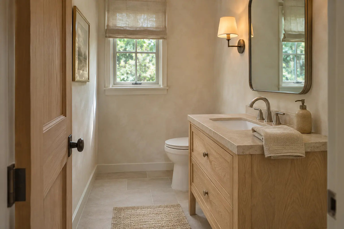
Article: Walnut vs Painted Mid Century Vanities: Which Finish Fits Your Bath
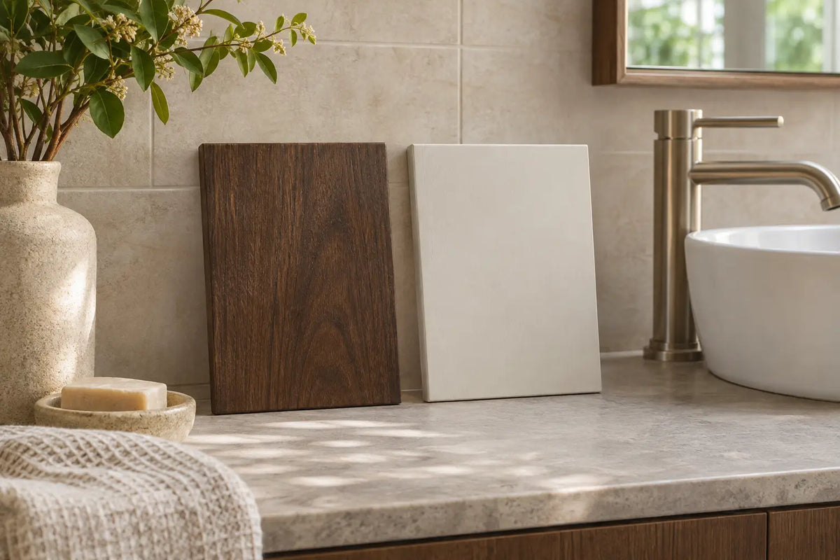
Walnut vs Painted Mid Century Vanities: Which Finish Fits Your Bath
A walnut face gives a bathroom a warm, furniture-like center; a painted front can let the whole wall feel quieter. For mid century vanity finishes, we'd choose visible grain beside quiet tile and a restrained countertop, or a calmer painted color when the room already has strong pattern. Reverse that choice if the actual samples compete with your fixed finishes. Before buying, confirm the face material, coating, complete footprint and maker's care instructions.
The BathGem's Blueprint
- Choose the visual task. Do you want visible grain to anchor a quiet room, or one consistent cabinet color to settle busy tile?
- Check the fit. Compare the complete assembly's depth and the open door path, not just the advertised width.
- Check the surface. Get the manufacturer's answer on veneer, solid wood, painted wood, or a wood-look finish before deciding how you'll maintain it.
Choosing mid century vanity finishes: start with the actual surface

Real walnut veneer, solid walnut, and walnut-look are different purchases
Real walnut veneer is a thin layer of walnut wood bonded to a supporting material. Solid walnut describes the wood within the specified part, while a walnut-look label describes appearance unless the maker identifies the material. A wood name on a checkout page isn't a cut list.
James Martin's Amberly 30-inch single vanity is a useful example: its manufacturer identifies natural walnut veneer and oval Champagne Brass knobs. That establishes the surface character and one intended metal pairing, but it doesn't establish that every cabinet piece is solid walnut. For a mid century modern bathroom vanity, look at the cabinet silhouette and storage alongside the finish name rather than treating the color as the specification.
Visible grain is the reason we'd choose a walnut vanity in a quiet room. It has variation at a scale that can make simple tile and a plain counter feel less bare, but strong vein movement in the stone can compete with it. Ask the seller whether grain direction is matched across adjacent fronts: a neat sample square can't show you the rhythm of an entire cabinet. Get a real finish sample next to your tile and top chip rather than comparing separate product photos.
The useful comparison isn't solid wood versus paint. Paint describes a finish, while solid wood and plywood describe construction underneath. James Martin's Amberly specification lists quarter-cut walnut veneer, plywood panels, and para wood and yellow poplar solids. That is mixed construction with a real walnut surface, not an all-solid-walnut cabinet.
Paint isn't always a perfectly smooth color block
Don't approve a painted vanity from its color name alone. Ask for the face material, substrate, coating and edge treatment in writing. Then inspect a full-size front or a representative sample for the texture you want. A black finish name doesn't identify the coating chemistry or timber species.
Keep a factory coating, a previous owner's repaint and an adhesive surface covering separate in your notes. Ask the maker which one is on the exact cabinet. Don't infer waterproofing, scratch resistance or permission to sand from a photograph or color swatch.
In a small bath, choose the footprint before the color

The doorway sees the vanity as one shape long before you notice its cabinet grain. James Martin's Amberly 30 specification lists a nominal cabinet width of 29 7/8 inches and body depth of 23 1/2 inches; its side drawing shows 24 1/8 inches to the knob. These cabinet-only drawings exclude the optional countertop and sink. The product page separately describes the vanity with top as 30 inches wide. Confirm the complete chosen assembly, hardware projection and required clearances rather than treating the cabinet body's depth as the final footprint.
We'd start by mapping the actual open bathroom door, toilet clearance, drawer pull-out, and the path you use to step toward the sink. Lay painter's tape where the cabinet face will sit and swing the door through its full arc; that catches a collision a showroom width filter won't. A freestanding cabinet with visible floor below it can feel lighter from the entrance than a solid box of the same width, but you still need useful storage. A floating vanity may reveal more floor, although the wall, plumbing and mounting plan must suit that option.
Don't let the top disappear from the plan. A counter edge can project beyond the cabinet and the faucet may need space behind the sink, so compare the chosen assembled configuration rather than a cabinet-only photograph. We'd rather see a usable single basin with landing space than a tiny top crowded by accessories just to achieve a particular silhouette.
If the room already has patterned floor tile, bold wallpaper, or many grout lines, we'd give the vanity a calmer surface. A white bathroom vanity can be a good place to start when you want the cabinetry to recede, as long as its white doesn't fight your tile's undertone. Put the swatches together under the actual sconces: a bright white cabinet next to warm ivory tile can look more disjointed than a warmer painted color.
In a larger bath, let one surface lead

A longer vanity wall gives grain room to make a statement, but it also multiplies visual detail. If your floor is quiet and your counter has restrained movement, we'd let the walnut face become the room's furniture moment. If the floor and walls already have strong pattern, a painted front can bring the composition back into focus. A dark cabinet isn't automatically too heavy; its contrast against the wall, top, and floor matters more.
For a strong graphic edge under a pale stone countertop, we'd consider a black vanity with simple hardware and enough light to show its silhouette. Test that combination from the doorway and again from the mirror, where the faucet and sconces enter the picture. A pair of identical mirrors and loud brass pulls can make a large bathroom feel busier than expected.
At a shared sink wall, finish shouldn't overrule function. Two sinks can consume the counter landing space for a toothbrush, shaving kit, or hair tool, even if a double vanity looks balanced in a product image. Decide where daily items will land before chasing a perfectly symmetrical two-basin layout. If you want two sinks, mark their basins and the space between them on the proposed countertop drawing before you select the grain or paint color.
Countertop pairings: balance grain, veining and color

Walnut with quieter stone
Our first pairing for pronounced walnut grain is a quiet warm-white quartz or restrained honed Carrara look. We'd keep the vein scale small enough that the cabinet grain can remain the interesting surface. If you love bolder marble movement, select the actual slab or sample alongside the wood so the two patterns aren't arguing.
Decide how much countertop you need around the basin before approving its shape. Trace the selected bowl and faucet locations on the proposed top drawing, then mark a place for daily items. Keep the countertop's own material and care instructions with the cabinet paperwork; a Carrara appearance doesn't identify the top's composition or approved cleaner.
Painted black or white with deliberate contrast
Black paint and a pale top make a crisp graphic pairing; white paint with a warmer stone can feel softer, especially against handmade-looking tile. We'd choose one dominant undertone before ordering. Three individually appealing whites can disagree once they're seen together under mirror lighting.
On a textured painted face, we'd let the counter provide the quieter line. Compare the actual front and top samples together rather than assuming a pale top will always be the calmer surface. Confirm the selected sink and faucet drilling separately from the staged photograph.
Explore our White Bathroom Vanities


Hardware and shape: make one coordinated decision

Pick the faucet and the cabinet pulls together
James Martin specifies oval Champagne Brass knobs on Amberly; its model sheet identifies the hardware as zinc alloy with that finish. Champagne Brass is the finish name here, not a claim that the knobs are solid brass. We'd also consider restrained brushed nickel with walnut if the other metalwork stays similarly quiet.
Put the cabinet pulls, faucet, mirror frame and sconces beside one another before ordering them separately. Confirm the faucet's required mounting pattern against the chosen top drawing. If the stone is doing enough visually, we wouldn't introduce a shiny third metal just because it looked good alone on a screen.
Look at legs and doors before chasing a historic label
Tapered legs and slab doors are the mid-century details we'd compare first. They describe shape, not proof of wood species or manufacturing date. With a reeded front, judge its shadows alongside the tile pattern; we'd choose the quieter face when the room already has many small surfaces.
James Martin warns that finish color can differ on screens because of monitor settings. We'd review a physical sample beside the fixed tile and top under the lighting you actually use. Your vanity has to live under night lighting too.
Explore our Mid-Century Modern Bathroom Vanities

72" Double Sink Bathroom Vanity with Top in Chestnut - James Martin Marcello

36-inch Mossavon Modern Single Bathroom Vanity in Oak Weathering Light Brown by Vellora

30-inch Mossavon Modern Single Bathroom Vanity in Oak Weathering Light Brown by Vellora

24-inch Mossavon Single Bathroom Vanity in Oak Weathering Light Brown by Vellora


Care: follow the selected coating and manufacturer

James Martin's general wood-care guidance says abrasive cleansers and scouring pads can remove the finish. It permits gentle wiping with warm water and mild dish soap and warns against soaking the wood. This is general brand guidance, not an Amberly-specific repair schedule; obtain the care instructions for your purchased finish before using wax, oil or refinishing products.
Wyndham Collection's furniture-care instructions say warm, soapy water or very mild detergents may be used sparingly. They warn that abrasive materials may damage the finish or remove protective sealants, and say not to use bleach-, ammonia-, or solvent-based cabinet cleaners. Countertop guidance is separate, so don't carry a stone-cleaning treatment over to a painted door. Wyndham's warranty excludes failures caused by improper maintenance or modifications including painting, so ask the maker before changing the factory finish.
Before attempting a repair, ask the manufacturer to identify the damaged layer and the approved treatment. Keep the original care guide and warranty with your order record. A generic repainting or oiling checklist isn't enough to establish what suits the selected factory finish.
Treat ventilation as a separate planning question. Tables 5-1 and 5-2 in Addendum e to ANSI/ASHRAE Standard 62.2-2022 give bathroom local-exhaust rates of 50 cfm for demand-controlled operation and 20 cfm for continuous operation; the Department of Energy's Building America guidance also calls for exhaust outdoors. These are cited planning benchmarks, not a determination of the law for your project. Ask the installer to confirm the applicable local requirements and delivered airflow; neither figure certifies a vanity as waterproof.
The USGS classifies water hardness of 121 to 180 mg/L as calcium carbonate as hard, and above 180 mg/L as very hard. Its guidance also describes hard-water spots and film. That classification doesn't rate a cabinet coating, so choose a dark surface because you like its appearance and follow the actual cabinet and top makers' separate cleaning instructions.
Before you order, check the surface, fit and paperwork

| Your room condition | Visual move we'd make | Confirm before checkout |
|---|---|---|
| Small room with patterned floor | Quiet painted front or restrained wood grain | Door swing, cabinet depth, sink landing space |
| Small room with plain pale tile | Walnut grain as a modest furniture note | Real veneer versus color name, cabinet edges |
| Large bath with lively stone | Paint or quieter-grained doors | Counter vein sample beside full cabinet finish |
| Dark floor and dark wall | Light top and defined cabinet silhouette | Night lighting and mirror/sconce metal finishes |
| Shared daily-use sink wall | Practical drawers and landing space ahead of symmetry | Sink count, selected top, rough-in and storage |
Before you pay, read the selected configuration rather than a generic photograph. Check which panels are veneer or solid wood, the coating's name and care restrictions, top material, faucet hole pattern, hardware finish, and the actual space the drawers need. Compare the correct product drawing with your wall and plumbing, especially if you're mounting the vanity. Don't plan storage from an unconfirmed door count or assume the base and wall-mount versions use identical installation steps.
Amberly illustrates why the document itself matters more than a download label. The manufacturer page labels its link Marcello, but the linked PDF identifies Amberly 30 and lists two doors and Champagne Brass hardware. That resolves the model's door and hardware specification against the merchant's conflicting single-door and chrome bullets. Confirm the exact ordered configuration in writing before relying on the listing's generic feature text.
Make the finish decision beside your tile and top
Take three things to the sink wall: the cabinet sample, the countertop chip and the proposed faucet finish. View them together from the doorway and under the lights you use at night. Choose the combination that supports the room's strongest existing surface, then obtain the matching finish specification, assembly drawing and care guide before you order.
Frequently Asked Questions

Todd Harmon
This comparison considers how walnut grain and painted color sit beside tile, stone, and real bathroom lighting. The cabinet's stated materials and proportions matter as much as its finish.
 Pick BathGems as a preferred source and Google will show you more of our design guides in Top Stories and AI results. Takes one tap while signed in to Google.