How to Balance Tile Layout and Vanity Scale in a Modern Bathroom
A bathroom can have expensive tile, a good vanity, and a perfectly decent mirror, and still feel wrong.
Usually the problem is not the product list. It is the order of decisions.
Tile gets chosen on one day. The vanity comes later. Grout is treated like a detail and picked at the tail end. On paper, everything works. In the room, it feels crowded, flat, or strangely tense. People tend to blame the vanity or the tile, but most of the time the issue is that the room was never planned as one visual composition in the first place.
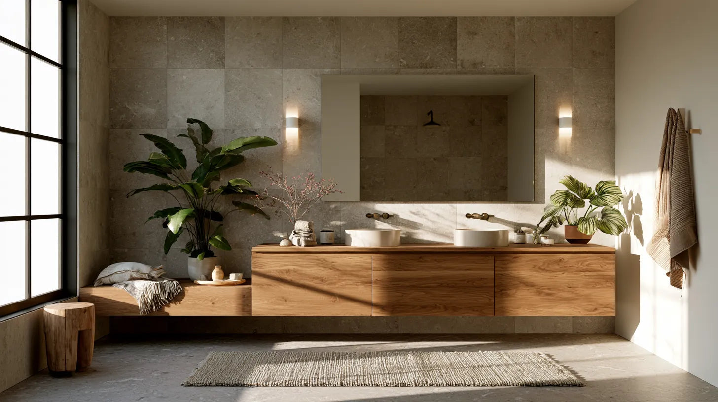
Tile Choices already has solid content around tile applications, grout direction, and wet-area performance. What tends to get overlooked is the vanity wall itself, and how quickly that part of the room can go off course once tile lines, grout contrast, cabinet shape, and lighting all start pulling on each other. That is also why vanity silhouettes that suit modern bathrooms need to be judged in the room, not as isolated product shots. A floating vanity does not behave like a freestanding one. A slim profile does not read like a heavier double unit. Width, toe shadow, finish, and shape all change the room.

In my experience, most bathrooms settle down the minute you decide what deserves first attention. That sounds obvious, but plenty of people never do it. They try to let every surface contribute equally, and that is where the trouble starts. A patterned floor, sharp grout, a thick mirror frame, dramatic sconces, and a substantial vanity can all be good choices. Put them together without hierarchy, and the room starts feeling noisy fast. On the other hand, when every finish is muted, the bathroom can go dead. The strongest rooms usually have one lead move, then a few quieter supporting ones.
Why the vanity wall is where bathrooms usually lose control
The vanity wall carries more visual weight than people think.

It has the sink, the countertop, the mirror, the lighting, the hardware, and usually the first full sightline from the doorway. So the tile behind it is never neutral, even when people think it is. Once grout lines start framing a cabinet, the whole wall reads differently. A tile that felt subtle on a sample board can suddenly feel busy. A vanity that looked crisp online can feel bulky in person. This is the part of the room that exposes weak sequencing.
I think people often ask the wrong question here. They ask what tile works with a vanity. The better question is what kind of visual load the vanity is already carrying.
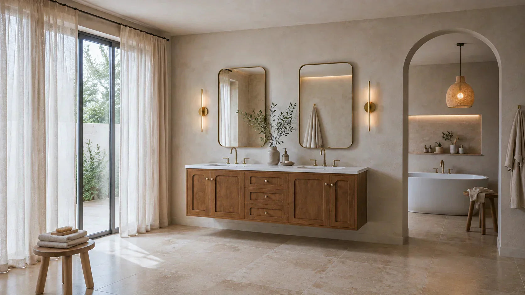
A floating cabinet with open space underneath gives the wall more breathing room. A freestanding vanity with a fuller base and heavier stance already anchors the elevation before the tile has done anything at all. Those are not small differences. The full range from light to heavy asks something different from the wall around it.

One mistake that shows up constantly is pairing a visually light vanity with a wall that has too many instructions built into it. Small tile. High-contrast grout. A mirror with a strong frame. Maybe aggressive sconces too. The vanity is supposed to feel clean and easy, but instead it starts to feel nervous. The opposite happens too. A big freestanding double vanity gets placed against a wall with so little structure that the cabinet looks weaker than it should. Not elegant. Just under-supported.
Start with the sightline, not the shopping list
Before choosing finish, format, or grout color, stand at the bathroom entry and ask a blunt question. What should the eye notice first?

That answer clears up a lot.
If the vanity is the anchor, the tile usually needs to stay a little calmer. Cleaner field tile helps. Softer grout helps. The wall can still have personality, but it should not keep interrupting the cabinet. If the tile is meant to carry the drama, the vanity usually needs more discipline. Not boring. Just edited.

That trade-off matters more than people want it to. A dramatic tile wall can be absolutely worth it, especially in a smaller bath where one strong move gives the room identity. But a statement wall almost always costs you freedom somewhere else. The mirror tends to need less personality. The grout usually needs to stop shouting. The vanity profile often needs fewer edges and less contour. Otherwise the room starts behaving like five separate ideas fighting for the same square footage.
That is when people say the bathroom feels busy, when what they really mean is that nothing agreed to play a supporting role.
Match tile format to the cabinet profile
Tile format changes the way a vanity reads. It just does.

Large-format field tile reduces interruption, which is one reason it pairs so well with floating or slimmer-profile vanities. It lets the cabinet stay clean. The wall reads as a surface rather than a pattern first. Small-format tile does the opposite. It introduces more rhythm because there are more joints, more breaks, more visible movement. That can be beautiful. It can also be a lot.
A simple comparison makes the point. Pair a floating oak vanity with stacked large-format wall tile and low-contrast grout, and the result usually feels composed and architectural. Now take that same cabinet and set it against a tight mosaic with bright grout lines. Suddenly the whole thing gets twitchy. The cabinet did not change. The wall did.

Reverse the setup and the logic changes too. A heavier freestanding vanity with a broader base can handle more pattern because it has enough mass to stand its ground. That is the part people miss. There is no universally right tile format. There is only a question of whether the cabinet has enough visual presence to hold the field around it.
Subway tile is a good example because the layout matters as much as the material. A stacked installation usually feels more orderly and current than an offset one with strong contrast at the joints. Vertical runs can help lift a lower vanity wall. Horizontal runs can widen the look of a compact single-sink setup.
A lot of modern bathrooms miss the mark quietly. Nothing is ugly. Nothing is obviously wrong. The room just feels like it is doing too much, and tile format is often part of the reason.
Grout is not a finishing touch, it is part of the architecture
Grout gets underestimated all the time.

Once grout goes in, the tile either reads as a broad surface or as a visible grid. That is not a minor change. Treating grout as a design decision rather than an afterthought is one of the highest-leverage choices in the whole room.
What matters visually is simple. Blended grout quiets the field. Soft contrast gives a little definition without turning every tile edge into an outline. Strong contrast creates a lattice. Sometimes that looks great. Sometimes it makes the room feel half a size smaller.

That is especially true when the vanity already has visible reveals, a thicker top, or more detailed front faces. Add a hard grout grid behind that, and the room can go from tailored to crowded in a hurry.
I have seen this happen after installation more times than I can count. The homeowner liked the tile. They liked the vanity. They even liked the grout chip. What they never really saw was the combination under the bathroom's actual light. Showroom lighting is forgiving. Bathroom lighting is not. A sample board on a counter will not tell you what a strong grout line is going to do once it sits behind a cabinet, next to mirror lighting, twice a day, every day.
That is why this choice should never be made casually.
Floor finish still has to do real work
The floor is where design ambition needs a little discipline.

Slip resistance is commonly discussed using COF and DCOF, with a DCOF of 0.42 or greater the benchmark generally referenced for interior level floors expected to be walked on when wet. Higher-risk zones like showers should push toward more traction, not less.
That has a practical consequence people do not always like hearing. You do not necessarily want the floor doing the same visual job as the vanity wall. A glossy wall tile can look excellent behind a mirror and sconce setup. On the floor, that same impulse can be less helpful. Matte or textured finishes often make more sense where water, steam, and daily use are involved. Smaller shower-floor formats can also improve grip and drainage because the added joints help create traction.

This is one of those places where I think people get too attached to visual continuity. They want one seamless material story from wall to floor because it sounds elegant. Sometimes it is. Sometimes it is just stubborn. The better bathroom is usually the one that lets the wall carry more of the visual statement while the floor handles safety and daily wear without complaint.
Planning dimensions matter more than taste alone
A bathroom can be stylish and still feel badly proportioned.

That is usually a layout problem before it is a style problem. Bathroom planning guidelines generally call for a minimum clear floor space of 30 by 48 inches at each fixture for access, at least 20 inches from the centerline of a lavatory to a side wall or tall obstacle, and at least 36 inches between lavatory centerlines for double lavatories.
Those benchmarks matter because they affect how everything reads.

Here is a scenario that comes up often. A double vanity technically fits the wall. On paper, the width seems right. But the side clearances are tight, the mirrors are oversized, and the wall tile has a format that exaggerates horizontal movement. Nothing is individually outrageous, yet the room still feels squeezed. The hardware looks sharper. The grout grid gets louder. The cabinet starts to seem too big, even though the real problem is compression around it.
That is why proportion needs to be checked before the finish palette gets romanticized. Layout pressure always turns into visual pressure later. Always.
A practical sequence before you order anything
The smartest way through this is not complicated, but it does require discipline.

Start with the main sightline from the entry. Decide what should read first.
Then decide whether the vanity is the focal point or the supporting shape.
Next, choose tile scale. Not grout yet. Format sets the rhythm.
After that, choose grout based on how much definition the room can actually handle. Blend it when the cabinet needs the wall to stay quieter. Increase contrast only when there is enough restraint elsewhere to support it.
Then check finish by function. For floors and shower zones, review traction guidance. For the vanity wall, think about sheen under sconces, mirrors, and daylight.

Then do the thing a lot of people skip. Sample the actual combination together. Not the tile alone. Not the cabinet finish alone. Look at them as a set, in the room, under the light they will live in. Bathrooms are not judged in pieces. They are judged all at once.
Where restraint usually pays off
The bathrooms that age best usually have hierarchy.

One element leads. The others support it. That hierarchy can come from tile, from the vanity, from color temperature, from grout contrast, or from the way the floor steps back and lets the wall do more of the talking. But it has to be deliberate.

That is the real point here. Balancing tile layout and vanity scale is not about making the room safer or softer just for the sake of it. It is about making the room readable. When cabinet profile, tile format, grout contrast, and floor finish are planned as one system, the bathroom feels settled. When they are chosen like separate purchases, the room usually tells on you immediately.
