
White Bathroom Vanity Finishes: Bright White, Warm White and Off White
White can look calm on a sample and strangely yellow once the countertop goes in. Usually, several whites with different undertones are finally sitting close enough to expose one another. Start with the fixed materials you can't easily change: counter, sink, tile, grout, and trim. Choose the cabinet white that belongs with them, then let the lighting confirm the choice rather than rescue it.
The BathGem's Blueprint
- Start with countertop, sink, tile, grout, and trim.
- Choose the vanity undertone that sits comfortably beside those fixed finishes.
- Test the group under the bathroom's real daylight and artificial light.
- Pick wall paint last. It's easier to adjust than cabinetry.
Bright White Works Best When the Room Is Already Crisp

A bright white vanity reads cleanest when the room already contains clear, cooler whites such as white porcelain, clean white quartz, cool gray tile, polished chrome, or brushed nickel. Choosing bright white merely to make a warm room feel brighter can backfire. Beside creamy stone or beige tile, the cabinet can start reading blue or stark because the surrounding surfaces make its cooler cast easier to see.
We'd use bright white for clear contrast against charcoal, navy, black, or cool stone, provided the other whites don't carry obvious yellow or beige. Compare the cabinet sample directly with the sink and counter before committing. White samples are polite alone. Put one beside another white and it starts talking.
Warm White Belongs With Warm Fixed Materials

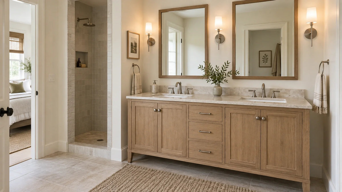
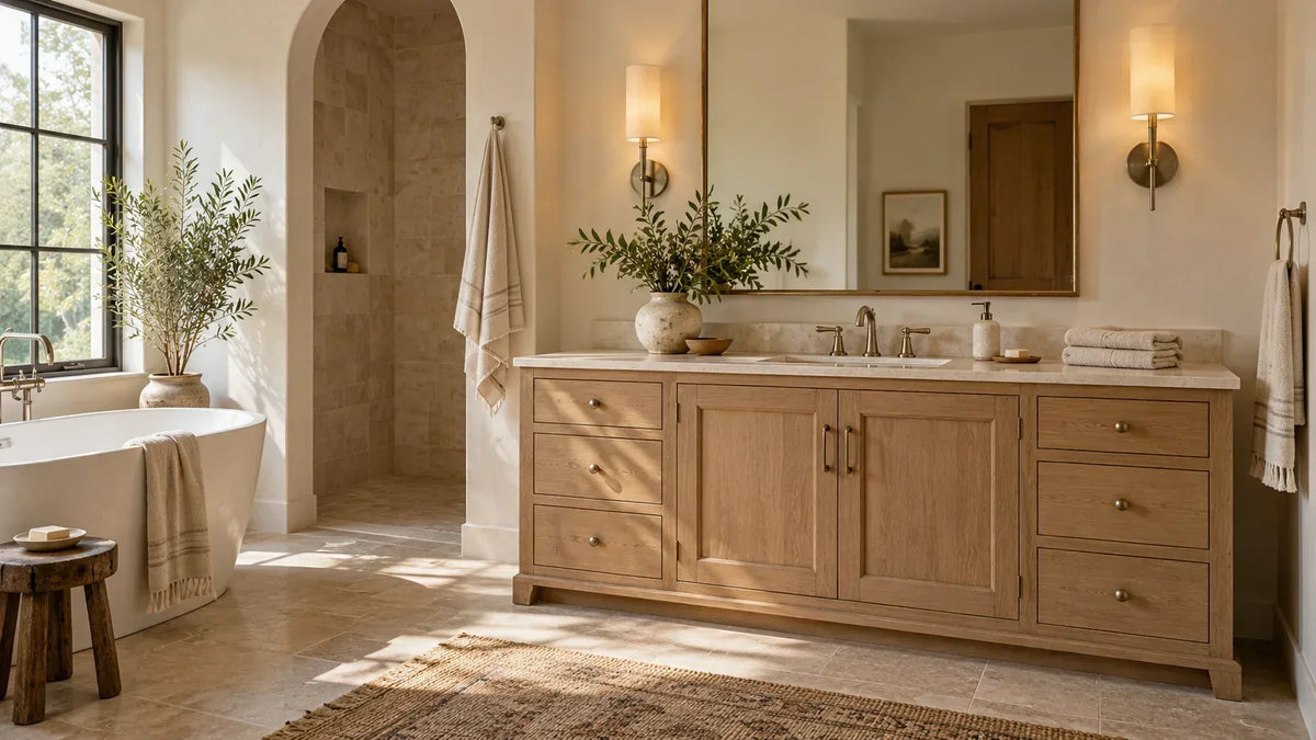
A warm white vanity can lean yellow or beige, and some whites carry a subtle red cast. That family can sit naturally beside travertine, creamy quartz, warmer marble, white oak, and brass. Beside blue-white porcelain or very clean quartz, the same cabinet can read noticeably warmer. We'd choose warm white because the room is warm, not because warm white is automatically safer.
A common ranking-page shortcut treats warm white as the forgiving default, especially in dim rooms. We wouldn't use that rule. Across four independent Houzz remodeling discussions, owners report off-white or warm cabinetry reading more yellow, creamy, or mismatched once a brighter white counter, tile, trim, or different lighting entered the room. That's owner-report evidence rather than a material rule; its value is the rejection test: if the cabinet looks wrong beside the fixed whites, room brightness won't make the disagreement disappear.
Off-White Is a Family, Not a Precise Color

Off-white can lean cream, ivory, greige, taupe, or muted gray, so the label alone isn't enough. We like it with softened fixed finishes such as honed limestone, aged brass, warmer grout, or muted stone. It is usually the wrong move when the room depends on sharp white-on-white contrast because products sharing the off-white label can still carry different undertones.
If you're sorting through bathroom vanity colors, compare whites side by side rather than approving each one alone. Sherwin-Williams' undertone guidance says holding color chips next to each other can help you spot undertone differences, and it notes that natural and artificial light affect how color appears. Across a cabinet face, that finish repeats over doors, drawer fronts, and end panels, so your eye gets far more evidence than it does from one small chip. The undertone hasn't changed; you've simply made it easier to see.
Explore our White Bathroom Vanities


| Finish family | Usually pairs best with | Walk away if |
|---|---|---|
| Bright white | Crisp porcelain, clean quartz, cool gray tile | It looks blue or stark beside cream or beige |
| Warm white | Travertine, creamy stone, white oak, brass | It reads yellow beside the sink or counter |
| Off-white | Muted stone, ivory tile, greige or taupe palettes | Its hidden gray, green, or beige cast fights the room |
Judge White at Vanity Scale, Not Paint-Chip Scale

A slight undertone becomes easier to notice once doors, drawer fronts, and end panels repeat it across a vanity. In the current BathGems catalog, the Breckenridge Bright White measures 59.88 inches wide by 23.5 inches deep by 33 inches high, while the Bristol Bright White measures 59.9 inches wide by 22.9 inches deep by 32.5 inches high. The Amici in White measures 48 inches wide by 22 inches deep by 35.25 inches high and offers white top options including White Carrara marble and White Quartz. Several whites can meet within one vanity before wall paint enters the conversation.
We'd rather see you test the cabinet sample beside the actual counter than approve several whites from separate browser tabs. The expensive white is the one that makes every other white look wrong. Scale changes how much of the finish your eye receives at once, so a cast that felt minor on a chip can become the dominant note across a 59.88-inch cabinet. If you're comparing a 60-inch vanity, judge cabinet, sink, top, and trim as one composition; our guide to a white vanity in a small bathroom is the useful next read when scale is part of the decision.
Explore our 60 Inch Bathroom Vanities


Lighting Reveals the Finish, It Doesn't Rewrite It

Color temperature changes the cast of the light falling on the vanity. ENERGY STAR describes 2700 to 3000 K as warmer or more yellow and 4000 K and higher as cooler or bluer; its current Downlights V1.0 criteria also require CRI Ra ≥ 80 and R9 > 0. A warmer lamp can make a bright white read creamier, while a cooler lamp can make the same finish read less warm. The bulb changes the illumination reaching your eye, not the cabinet pigment underneath it.
For color matching, pay attention to color quality as well as Kelvin. ENERGY STAR's downlight criteria give you a useful baseline, while ANSI/IES TM-30 provides a broader color-fidelity framework whose Fidelity priority levels begin at Rf ≥ 85 and Rf,h1 ≥ 85. Those aren't universal bathroom requirements, but they're useful thresholds when consistent color rendition matters. Test every finish under the same lighting setup so you're comparing the cabinet, not two different light sources.
Test the Finish Before You Commit

Do the comparison in the orientation the materials will actually live. Hold the cabinet sample vertically, lay the counter sample flat, and place the tile, sink, grout, and trim beside them at the same time. Check the group in daylight if the room gets it, then again with the vanity lights on. Finish by stepping back to the doorway, because a combination that looks harmless at close range can read differently once the whole vanity wall is in view.
The sample-board white test
- Hold the vanity sample vertically, the way the cabinet will sit.
- Place the counter, tile, sink, grout, and trim samples beside it together.
- Check the group in daylight, then again with the bathroom lights on.
- Step back to the doorway and compare from room distance.
- Choose wall paint after the fixed pieces agree.
Protect the Finish You Chose

Once the color is right, don't undo the decision with aggressive cleaning. James Martin's one-year limited warranty does not cover damage tied to adverse or hazardous chemicals or abrasive cleaners containing alcohol or other solvents. Wyndham's furniture care guidance says harsh or abrasive materials may damage the finish or remove protective sealants, and it says not to use bleach-, ammonia-, or solvent-based cleaning products. We'd follow the cabinet maker's care instructions instead of assuming every painted white finish tolerates the same cleaner.
Sheen changes what your eye notices even when the color stays the same. Under raking sconce light, a glossy door tends to show fingerprints and dried droplets more clearly because the reflection is concentrated and those residues interrupt it. We wouldn't choose sheen from a product photo alone.
What We'd Choose

Bright white is our call for crisp porcelain, clean quartz, cool stone, and sharper contrast. Warm white makes more sense beside cream, travertine, white oak, and warmer metals, while off-white earns its place when the room is already softened by muted stone or greige. If the fixed finishes disagree with the cabinet under your real lighting, change the cabinet family before you start changing bulbs and wall paint to compensate. That keeps the expensive decision tied to the materials that are hardest to replace.
Once you know which family belongs in the room, compare live white bathroom vanities by finish and size. Then narrow the shortlist by the cabinet width, sink count, and counter configuration your layout can actually support.
Frequently Asked Questions

Todd Harmon
White vanities are less about finding the purest white than getting the room's whites to agree. Todd's point of view here is to let stone, porcelain, tile, and light expose the undertone before cabinetry commits the room. With over two decades in e-commerce and product curation, Todd built BathGems on a simple idea: a bathroom should feel as collected and considered as the rest of the home. He sources every vanity and fixture in the BathGems catalog the way a designer pulls samples, weighing material, proportion, finish quality, and how a piece actually lives in a real room over time.