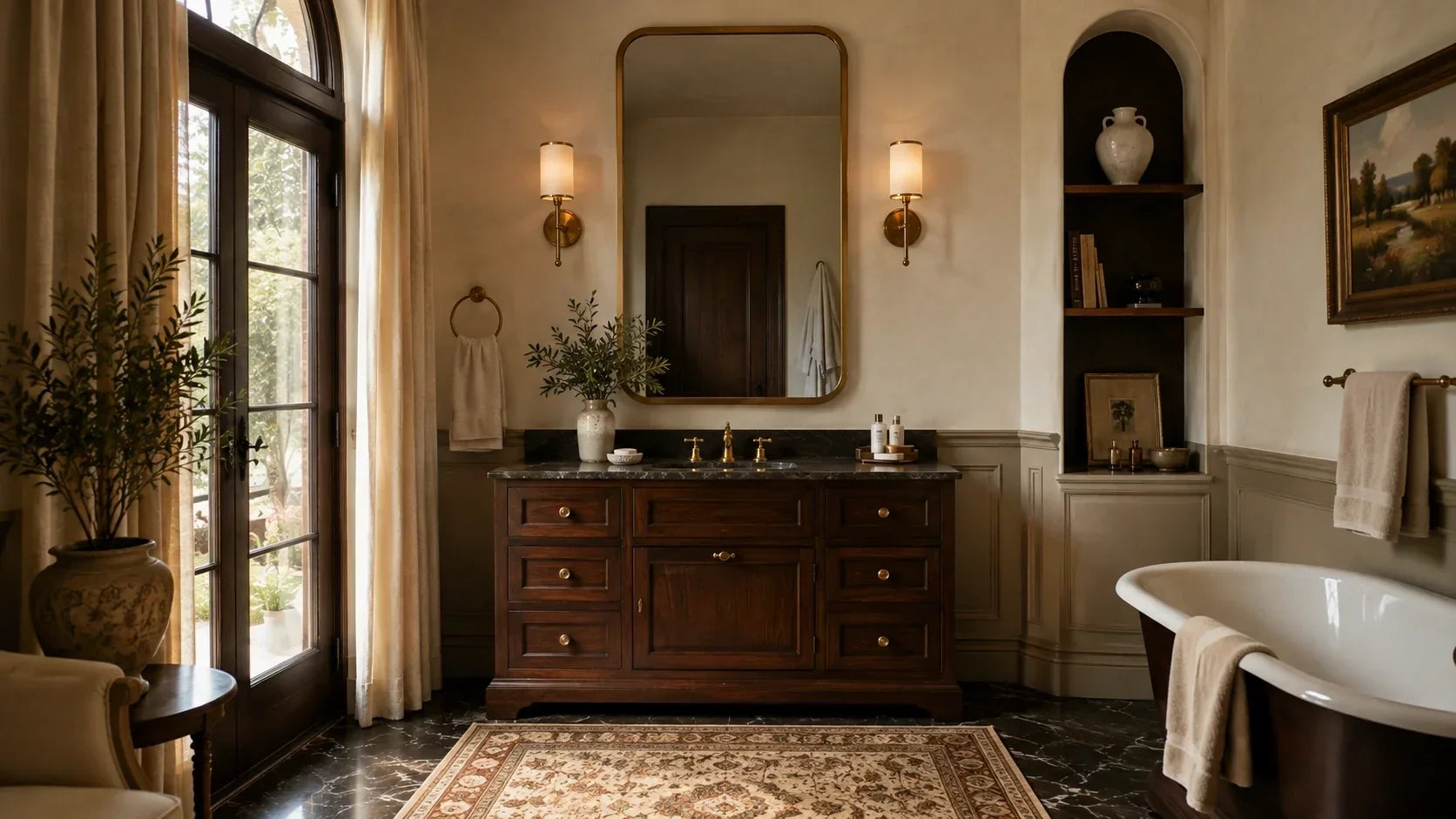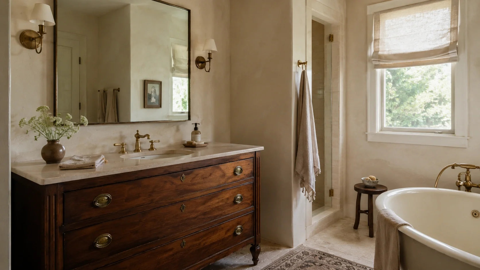
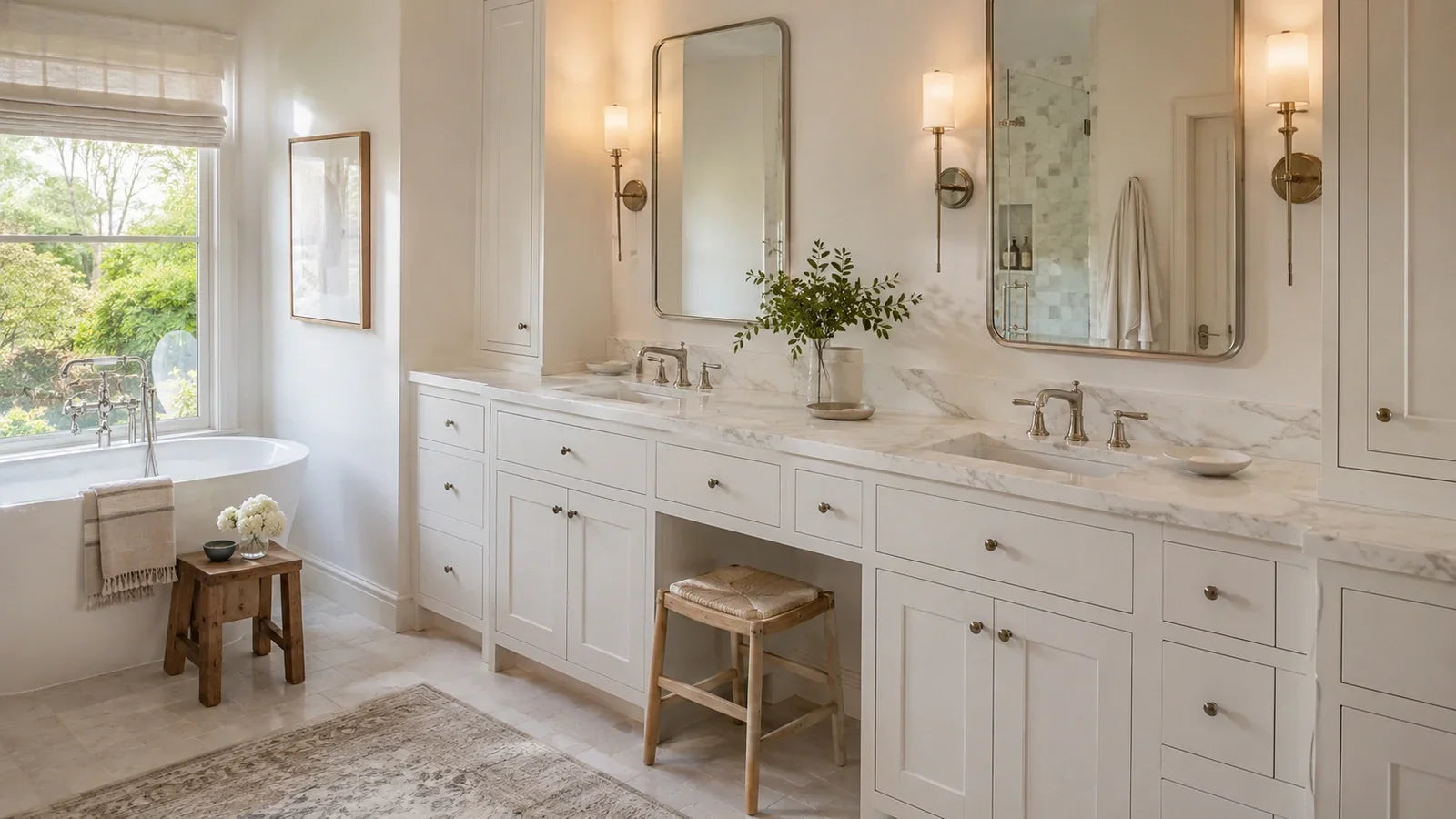
White Bathroom Vanity Guide: Warm Whites, Hardware and Countertops
A white vanity gives you breathing room, but it isn't as neutral as it looks. The best white bathroom vanity ideas start with a detail most rooms get wrong: white has an undertone, and that undertone changes beside stone, tile, metal, and bathroom lighting. We love a white vanity because it gives the rest of the room space to speak, but the cabinet can't carry the palette by itself. Put a creamy white beside icy quartz and cool gray tile, and a finish that looked quiet on its own can suddenly look yellow.
The BathGems Brief
The white cabinet is the easy part. The decisions around it determine whether the room feels warm, crisp, or slightly off.
- Read the fixed surfaces first. Tile and flooring get the deciding vote when they're staying.
- Choose a vanity white that belongs with those undertones rather than searching for a universal white.
- Use the countertop and hardware to add contrast, warmth, or movement.
- Give the room one strong point of contrast, then let the rest stay quiet.
If you're renovating around existing tile, don't choose the vanity in isolation. It's much easier to adjust wall paint or hardware later than to make two large fixed surfaces stop arguing with each other.
White Bathroom Vanity Ideas Start With the Undertone

White becomes much easier to work with once you stop treating it as one color. Some whites lean creamy or beige. Others feel cleaner and cooler, especially next to gray stone, blue-gray tile, or polished chrome.
You don't need a designer's color vocabulary to see the difference. Hold the samples directly beside each other and ask a simpler question: which one suddenly looks wrong? To see how different whites settle into finished rooms, browse our white vanity bathroom ideas.
Warm White vs. Cool White Cabinets
Warm white works especially well when the room already contains warmth. Think travertine, limestone-like porcelain, beige floor tile, white oak, softer marble veining, or walls with a creamier cast.
A cleaner white makes more sense when the surrounding materials are crisp. Cool gray stone, bright porcelain, chrome, blue-gray tile, and cooler wall colors can make a warmer cabinet look noticeably creamier than it did on its own.
The detail most buyers miss is orientation. A countertop sample lying flat receives light differently from a cabinet door standing vertically, so two finishes that look close on a table can separate once installed. We recommend viewing the samples in the bathroom in the same orientation they'll have in the finished room.
Then check them again after dark. A vanity chosen beside a sunny window at two in the afternoon may spend most weekday mornings and evenings under sconces and ceiling fixtures. The smart move is to approve the white under both conditions.
Warm white vs. cool white cabinets isn't a decision you make in isolation. Follow the expensive surfaces that are staying, and don't force a crisp blue-white cabinet into a bathroom full of warm stone because the cabinet looked cleaner online.
An Off White Bathroom Vanity Can Be the Better White
An off white bathroom vanity earns its place where pure white feels disconnected from the materials around it. Against warm stone, natural wood, aged-looking metals, or linen-colored tile, a little cream can make the whole palette feel more settled.
A cream bathroom vanity doesn't automatically read yellow or dated. The problem usually appears when cream sits directly beside a much cooler white and your eye starts comparing the two.
This is also where an antique white bathroom vanity can make sense. A softened white, whitewashed oak, or antiqued finish gives warm stone and traditional details more room to breathe than a hard glossy white.
Avoid the mistake of judging the cabinet only against your current wall paint. Homeowners often hold a warm cabinet sample against a bright white wall, decide the cabinet looks yellow, and reject it even though the wall is the easiest surface in the room to repaint.
Put the cabinet finish beside the tile, countertop, hardware, and proposed wall color instead. You're choosing a relationship between materials, not a winning paint chip.
Hardware for a White Vanity Should Control Contrast

Hardware has more visual weight on white cabinetry than its size suggests. A dark pull against a white drawer front reads immediately, while that same pull can almost disappear against walnut.
That makes hardware for white vanity cabinets less about picking your favorite metal and more about deciding how much contrast the room needs.
Brushed Nickel Keeps the Palette Quiet
Brushed nickel is our first choice when you want the cabinet to stay visually calm. It gives white enough definition without outlining every door and drawer.
Polished chrome has a sharper, more reflective presence. In a busy sink zone, water spots and fingerprints tend to catch your eye sooner than they do on a softer brushed surface.
Chrome still has a clear design job. It works particularly well when the faucet, shower trim, or lighting already establishes that cooler metal elsewhere in the room.
Put a cool reflective metal beside a slightly creamy cabinet and the cabinet may suddenly read warmer. You want to see that relationship before every pull has been drilled into place.
Brass Makes Warm White Feel Intentional
Brass and satin-gold finishes can give a warm white cabinet a reason to be warm. They work particularly well when there's another related note in the room, such as white oak, warm marble veining, linen-colored tile, or a softer wall color.
We wouldn't use brass as the lone warm note in an otherwise icy bathroom. Give it something to talk to.
If you're considering unlacquered brass, choose it because you like a finish that develops visible patina with handling and time. Skip it if you want every pull to remain visually identical.
Matte Black Needs Repetition
Matte black creates the strongest graphic contrast of the three. On a small white vanity, a pair of black pulls can be enough. Across a long double vanity, six or eight dark pulls can become one of the dominant patterns in the room.
We recommend repeating black somewhere else if you choose it, perhaps in the mirror frame, sconce detail, shower enclosure, or faucet. One isolated set of black pulls often feels more accidental than deliberate.
If your countertop already has strong veining or your tile carries a noticeable pattern, we'd usually soften the hardware instead. Every finish doesn't need to ask for attention.
You Don't Have to Match Every Metal
Existing chrome or nickel plumbing doesn't automatically rule out brass cabinet hardware. Mixed metals work best when each finish has a clear job and the second metal appears more than once.
Nickel faucets and shower trim can sit comfortably with brass pulls and brass sconces. What we'd avoid is a brass faucet, black mirror, nickel shower trim, and another finish on the lighting because each piece was chosen from a different tab three weeks later.
Two metals can feel connected. Four can look like decisions made in different months.
Countertops: A White Vanity With Marble Top or Quartz

The countertop is where a white-on-white bathroom either gains depth or loses it. It's the horizontal break between the cabinet below and the mirror, backsplash, and wall above, so even restrained veining can do useful visual work.
Trying to match the countertop white exactly to the cabinet isn't our first recommendation. An intentional material difference is easier on the eye than two almost-matching whites.
A White Vanity With Marble Top Needs Visible Separation
A white vanity with marble top works especially well when the stone has enough movement to establish itself as a separate material. Carrara marble is an obvious example because its gray veining interrupts the white field without requiring another strong color.
A warm white can work beside Carrara-style marble too. Don't decide from the material names alone. Put the actual cabinet and stone samples together and make sure the stone's background doesn't push the cabinet noticeably yellow.
A warmer vein can connect a creamy vanity to brass or natural wood, while cooler gray movement can support nickel, chrome, and gray tile. The countertop edge creates another useful line between two pale surfaces.
Explore our White Bathroom Vanities


Marble or Quartz Comes Down to How You Want to Live With It
Natural marble has something engineered stone can't reproduce exactly: every slab has its own veining and variation. It can also etch and stain, so the smart move is to choose it only if you're comfortable with a surface that may show some evidence of use over time.
Sealing helps with stain resistance, but it doesn't make marble immune to etching. Care recommendations also vary by stone, finish, and sealer, so follow the instructions for the exact top you buy rather than assuming every marble needs the same routine.
Engineered quartz is easier for buyers who want the pale stone look without the same sealing routine. It still deserves sensible care, but you don't have to pretend you're the person who'll enjoy monitoring a natural-stone finish if you know you won't.
| Feature | Natural Marble | Engineered Quartz |
|---|---|---|
| Visual character | Natural variation and one-of-a-kind veining | More controlled pattern and color consistency |
| Sealing | May require sealing based on the stone and finish | Generally does not require sealing |
| Etching | Can etch from acidic products | Doesn't have marble's calcium-carbonate etching behavior |
| Best fit | You value natural stone character and accept some patina | You want lower-maintenance daily use and visual consistency |
If you love natural marble because it looks better as it becomes yours, choose it and care for it properly. If every water ring or cosmetic mark is going to bother you, we'd take the quartz and enjoy the bathroom.
Before you order either top, confirm the faucet-hole configuration. A pre-drilled top may be set up for a particular faucet pattern, and the wrong time to discover that mismatch is after the vanity has been delivered and the plumber is standing in the room.
The Sample-Board Test
Put these five things together before approving the palette:
- Vanity finish sample
- Countertop sample
- Backsplash or shower tile
- Wall paint sample
- Hardware finish
Look at them in daylight, then look again with the bathroom lights on. Stand the cabinet sample vertically and leave the countertop flat so the materials receive light closer to the way they'll sit after installation.
Don't ask whether every white matches. Ask which sample suddenly looks too blue, too creamy, too gray, or too stark when the group is together. That's usually the more useful answer.
Sizing a White Double Vanity

A white double vanity creates a much larger field of one color than a powder-room cabinet, so proportion matters. Two sinks may fit on paper without leaving enough useful counter space for two people to get ready comfortably.
A 60 inch double sink vanity is a useful place to start when you're planning two sinks, but width alone doesn't tell you whether the layout works. Check the actual sink dimensions, centerlines, drawer configuration, plumbing locations, and usable landing space between and beside the bowls.
Before ordering, measure more than the empty wall. Check vanity depth, baseboard or door-casing interference, the bathroom door swing, and whether drawers can open without meeting an adjacent wall, toilet, or trim.
Measure the delivery path too. A cabinet can fit the installation wall and still be awkward to maneuver through a narrow doorway, hall turn, or tight bathroom entry, especially if it arrives assembled.
Sink type changes the usable counter as well. A vessel bowl occupies the countertop surface itself, while an undermount sink leaves more uninterrupted space around the rim. On a tight double vanity, that difference matters every morning.
We'd rather have one well-planned sink with useful drawers than squeeze two bowls into a cabinet simply because the top can accommodate them. If two people regularly use the bathroom at once, the second sink can be worth the counter-space tradeoff.
Drawer layout matters more than it gets credit for here. Two 60-inch white vanities can look nearly identical from across the room while functioning very differently once the drain, trap, and supply locations begin competing with the center storage.
The smart move is to compare the vanity's interior layout with the actual plumbing rough-in before installation day. A drawer bank isn't useful if the plumbing needs to occupy the same space.
Measure the Room in Motion
The wall measurement is only the beginning. Open the bathroom door. Pull the vanity drawers out. Think about the shower door, toilet position, towel bars, and how two people move through the room at the same time.
Most buyers measure an empty wall because that's the easy number. The better measurement is the space left when everything around the vanity is actually being used.
If you're designing for accessibility, don't borrow a generic vanity-height recommendation from a style article. Accessible lavatories have specific height, knee-clearance, and approach requirements, so the cabinet and sink configuration need to be planned around the standards that apply to the project.
Let the Mirrors Break Up a Long White Cabinet
Two mirrors can visually divide a long white vanity into individual stations. One wide mirror does the opposite, creating a calmer continuous line across the cabinet.
We recommend deciding whether you want the vanity to feel like two personal zones or one long architectural element, then choosing mirrors and sconces to reinforce that decision.
Hardware quantity deserves another look on a double vanity too. Six or eight matte-black pulls create much more visual rhythm than two pulls on a small cabinet. If the stone and lighting already have presence, restrained hardware is often the smarter move.
Explore our 60 Inch Bathroom Vanities


White Vanity Bathroom Ideas That Don't Wash Out

The real risk in an all-white bathroom isn't that white looks bad. It's that every surface becomes equally smooth, equally pale, and equally quiet until your eye has nowhere to land.
The best white vanity bathroom ideas solve that with material rather than more color. White oak grain, honed stone, woven fibers, linen, reeded glass, or dimensional tile can do more for the room than introducing another slightly different shade of white.
Add One Material With Visible Grain or Movement
You don't need much. A white oak stool, wood-framed mirror, small woven basket, or stone with visible veining may be enough to break the smoothness around a white cabinet.
We recommend repeating that material once rather than scattering several unrelated textures around the room. A little repetition makes the choice feel connected.
The same principle applies to tile. If the color stays quiet, a handmade-looking surface or subtle dimensional pattern can keep the wall from reading like another flat white plane.
Check the Bathroom at Night
Samples approved at noon on the kitchen table aren't necessarily telling you how the finished bathroom will feel. Most weekday routines happen early in the morning or after daylight has faded, when the sconces and ceiling fixtures are doing most of the work.
Bring the samples into the bathroom and look at them under the fixtures you'll actually use. Pay particular attention to lighting close to the mirror and vanity, since it falls directly across the cabinet, countertop, and wall surfaces you're trying to coordinate.
Warm floors and walls can also reflect color back onto a white cabinet. If an off-white finish only looks right in strong daylight, you haven't finished testing it.
Humidity belongs in the practical side of this decision too. If the room stays damp after showers, use the exhaust ventilation consistently and wipe standing water from cabinet edges and the sink zone. A white vanity looks its best when the finish isn't being asked to live in lingering moisture every day.
Give the Room One Strong Contrast
White creates room for contrast, but you don't need to fill all of it. Strong marble veining, matte-black hardware, patterned tile, sculptural sconces, and a statement mirror can each work with a white vanity. Put all five together and the cabinet stops being the quiet center of the room.
If the stone already has movement, we'd let the hardware settle down. If the countertop is nearly solid white, use tile, wood, or metal to give the room something tactile to read.
A white vanity is good at being the backdrop. Let it do that job.
The White Vanity Formula We'd Use

There isn't one correct white bathroom, but there are combinations we trust more than random finish mixing.
| Room Direction | Vanity | Countertop | Hardware | Supporting Material |
|---|---|---|---|---|
| Soft + warm | Warm or off-white | Warm-veined stone | Brushed brass | White oak |
| Clean + quiet | Cleaner white | Restrained quartz | Brushed nickel | Textured pale tile |
| Graphic + modern | Crisp white | Veined or contrasting top | Matte black | Repeated black detail |
Start with the row closest to the expensive surfaces already staying in your bathroom. If your shower is wrapped in warm stone, the soft-and-warm direction is doing you a favor. If the room already has crisp porcelain and chrome plumbing fixtures, fighting that temperature usually creates more work.
The formula isn't meant to make every bathroom look alike. Its job is to keep one finish from drifting away from the rest of the room while you're choosing pieces one at a time.
Build From What Isn't Changing

The easiest way to style a white vanity is to stop asking which white you like best and start asking which white belongs in the room you actually have. Let the floor, shower tile, and other permanent materials establish the temperature. Then choose the cabinet, stone, and metal in that order.
Before you commit, put the samples in the bathroom one last time, stand the cabinet finish vertically, switch on the lights you'll actually use, and open everything around the vanity that moves. Color and fit problems are much cheaper to solve while they're still samples and measurements.
If you're still deciding how the vanity fits the larger room, our guide to the most popular bathroom vanity sizes is the useful next step before you lock in the cabinet width. The goal isn't to make every white match. It's to make every finish look like it was chosen in the same room.
Frequently Asked Questions

Todd Harmon
White cabinetry works best when you stop treating white as the safe choice and start treating it as one material in a larger palette. The stone, metal, tile, and bathroom light decide whether that cabinet reads crisp, warm, or slightly wrong. With over two decades in e-commerce and product curation, Todd built BathGems on a simple idea: a bathroom should feel as collected and considered as the rest of the home. He sources every vanity and fixture in the BathGems catalog the way a designer pulls samples, weighing material, proportion, finish quality, and how a piece actually lives in a real room over time.